 |
History Of The Nestle Logo |
Nestlé is one of the greatest companies in the world. It has a long history and very interesting logo. But do you know history of the Nestle logo? Have you ever seen old Nestle logos? This famous logo has long and very interesting story.
I have sent a letter to the Nestle Company. When they answered and sent me history of their logo I was delighted as an archaeologist which digged up a new dinosaur skeleton.
I am pleased to share the history of the Nestle Logo with you.
Special thanks to Nestlé for help
Vitaly Pedchenko, Etiziano
 |
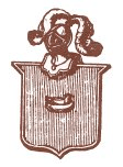
The Nestlé logo was launched by Henri Nestlé in 1868 on the basis of the meaning of his name in German, i.e. little nest, and of his family emblem (that you can see here). |
|
Henri obtained a 15-year French patent for his logo in 1868.
After he retired, it was registered in Vevey in 1875 by the new owners of his company. |
|
In 1938, the traditional nest design was combined with the "Nestlé" name to form what is called the combined mark. |
|
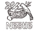
In 1966 the design was simplified. |
|
In 1988, the worm in the mother bird's beak was removed and the fledglings became two instead of three. It is said that it was meant to better illustrate the activities of the company, no longer active only in nutrition, and to reflect the average modern family of two children. |
|
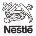
The logo we know now has just been simplified.
The tree is supposed to represent an oak and the birds thrushes. |
You see that this logo has it's own life and story, it was changed many times to stay modern and have up-to-date look.
Sometimes it is very good idea to update old logo of your company. That is why many old companies do a million-dollars rebrandings.
|


