 |
Two Similar Rebrandings. Xerox and AT&T |

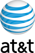
AT&T logo was changed on November 21, 2005.
"The new logo reinvigorates the AT&T globe — one of the most recognized corporate symbols in the world. The new globe is three-dimensional, representing the expanding breadth and depth of services that the new AT&T family of companies provides to customers, as well as its global presence."
From AT&T press release |
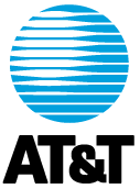
As you can see old logo was flat and used only two colors: blue and white. The designers have saved the association with past logo and blue&white color scheme (but with gradients). Now logo has 3D sphere and name of the company in lowercase letters.
New Xerox logo was unveiled on January 07, 2008.
"The new Xerox logo is now a lowercase treatment of the Xerox name - in a vibrant red - alongside a sphere-shaped symbol sketched with lines that link to form an illustrative "X," representing Xerox's connections to its customers, partners, industry and innovation, and designed to be more effectively animated for use in multi-media platforms."
From Xerox press-release. |
As you can see Xerox used the same tricks as AT&T in their logo. It uses 3D form, text is in lowercase, also, Xerox use gradients in their logo.
So we can see three tendencies in rebranding of the big corporations' logos:
1. Use of lowercase letters. It looks friendlier to the customers.
2. Use of 3D forms. Such logos look trendy.
3. Use of gradients. The printing costs of such logos are bigger but for such companies as Xerox and AT&T it’s not such an important factor as for smaller companies.
|


